When an e-commerce site is created, a lot of focus goes into the homepage. After all, it’s the first thing visitors see when they arrive.
But you also need stellar product pages in order to drive sales on your website.
Product pages immediately convey the value of a featured item and help to convince customers that the product is a must-have.
Why Are Product Pages Important?
Is your conversion rate a touch flat despite the fact your e-commerce website is getting a healthy amount of traffic? Well, the average conversion rate is around 2.42%. If yours is below this, then there’s definitely room for improvement.
Whilst you can dig through analytics and e-commerce benchmarks to try and find the root cause, a quick look at your product pages can help you identify one aspect of your low conversion rate: poorly designed product pages are often a key contributor.
87% of consumers rate product content as extremely or very important when deciding to buy. So in simple terms, product pages are important for two main reasons:
- Poorly designed and under-optimized product pages will not satisfy or convince users, which leaves a lot of potential revenue on the table - especially if you’re spending money on advertising.
- A well designed and optimized product page that follows best practices and CRO techniques will quickly convince users that this is the product for them, giving them the final push they need to start the checkout process.
Leading e-commerce brands can be seen implementing multiple CRO techniques on their product pages, including customer testimonials, scarcity tactics, product recommendations, product explainer videos, and more.
With that in mind, we’ve rounded up 12 of the best product pages we could find to help review and inspire yours.
Example 1: Gymshark
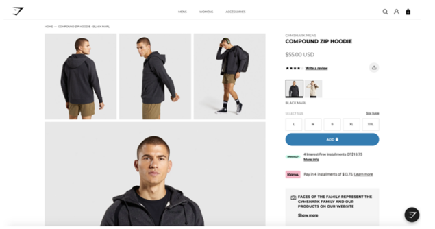
Gymshark has become one of the hottest brands in the world over recent years thanks to its influencer marketing strategies and genuinely authentic approach to marketing. They occasionally do the odd pop-up store, but for the most part, all sales go through their website, so it has to be good. Their product pages don’t disappoint either.
Why it’s good
Gymshark has mastered online shopping with product pages that are led by an engaging balance of quality images. Gymshark also offers precise sizing, color variants, and reviews clearly visible on the page.
Added to this Gymshark highlights alternative payment options, specifically Klarna and Afterpay. So if a potential buyer was thinking of buying a few new gym outfits they know they can spread the cost, and can even see how much it would cost them on the product page itself.
Example 2: Nike
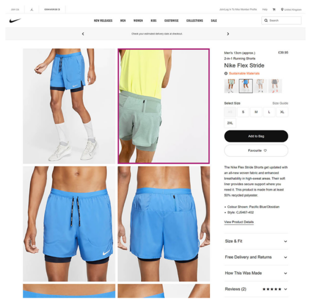
Nike is one of the most well-known brands in the world so it won’t need much of an introduction. They recently revealed fast eCommerce growth as more than a third of its sales take place online.
Why it’s good
Nike is one of the world’s most well-known brands, so you can count on its product page to be impressive. And Nike certainly doesn’t disappoint - an automated video displays how the product functions while different features and benefits are clearly labeled, with special attention given to the sustainability of materials.
Reviews are displayed and delivery information is easily accessible, which alleviates uncertainty and removes potential barriers to purchase. Nike also has a “how this was made” dropdown for customers who value sustainability and transparency when buying clothing.
Example 3: ASOS
ASOS is of the biggest eCommerce websites in the world with around 80m visits per month according to SimilarWeb, so it’s safe to assume we could all learn a few things from picking apart their product pages.
What you should take from this example
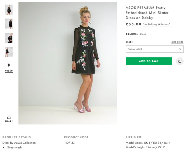
ASOS is a company that offers an online shopping experience for people to find the latest and most popular fashion products. The ASOS product pages are simple but functional, giving customers all of the information they need about each piece in order to make their choice.
They show full body shots of the models so browsers can really see the product, and also offer video shots of the model walking and demonstrating the clothes in action. A nice little touch is also clearly highlighting the size and fit section showing the heigh of the model and what she is wearing.
Example 4: Allbirds
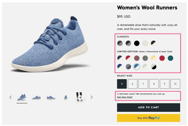
There are some products that consumers don’t even want until they’re no longer available. Allbirds are acutely aware of this, which is why they differentiate between limited edition items and their classics. They want their customers to know when there will only be a limited number of shoes available for sale.
What you should take from this example
Products that are in scarce supply are more desirable because people know that the product may no longer be available the next time they return to the site.
Allbirds are so confident in their shoes that they offer customers the option of trying them for 30 days before deciding whether to buy. The company also provides a video in which a model walks, sits, and runs around while wearing Allbird’s products.
Allbirds go above and beyond product images by offering videos on all aspects of day-to-day usage from walking to running. They even show how the shoes respond when someone sits down with their heels wedged deep into the footbed - just as an office worker might do!
Example 5: Rocky Mountain Soap
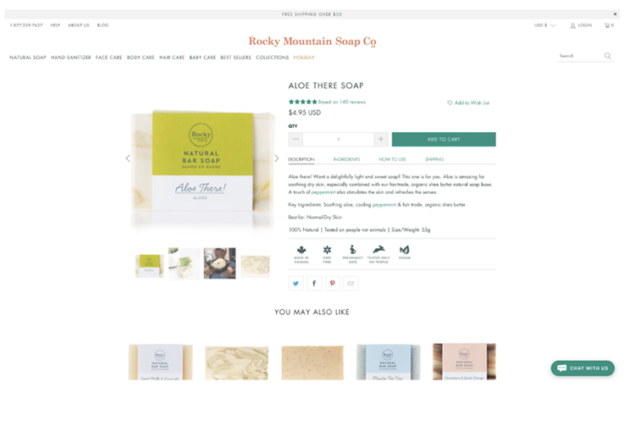
Rocky Mountain Soap, a natural body care retailer that doesn’t test its products on animals or use any animal by-products in the production process, knows that many customers are looking for high-quality ingredients. People want to what is going into, and onto, their bodies.
What you should take from this example
The concise product pages include descriptions with key benefits - such as being vegan-friendly and GMO-free - which provide consumers with the important details and in turn help to drive sales.
Rocky Mountain Soap’s product pages are tailored uniquely to offer the purchaser a sense of social proof. As well as browsing through their products, you can scroll down and read reviews from other customers who have already purchased said items - making it easy for users to overcome any hesitation about purchasing.
Example 6: Leesa
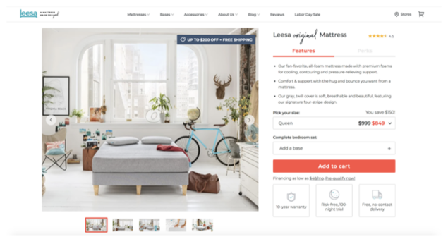
Leesa is a mattress company that uses high-quality materials to make getting to sleep easy as possible. They have thought about all of the necessary details when it comes to buying a new mattress online. Their informative product pages, which place key information regarding warranty and delivery front and center, address many of the concerns someone might have before purchasing a mattress.
What you should take from this example
Leesa is a company that invests more than just money in its products. Their mattresses are designed for comfort and longevity, while they also offer their customers all the information they need before making a purchase with product reviews and FAQs.
Leesa even seeks out sleep specialists who can lend an opinion on how well each mattress fares against specific needs such as back or stomach sleeping preferences.
Example 7: Missguided
What you should take from this example
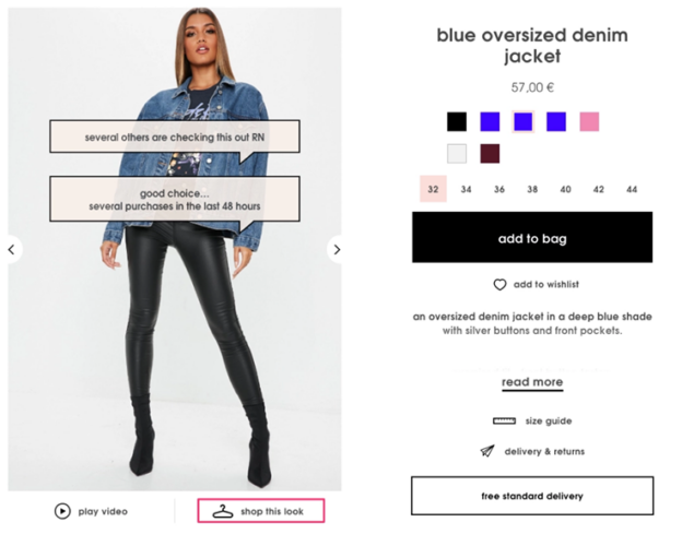
Missguided uses a clever technique to convince you that the product is worth checking out: they
combine social proof with scarcity.
First, they affirm your interest in it by saying “good choice”. Then, when presenting their images of the products for sale on their website or app, they add labels like “several others are checking this out right now!”. They don’t directly tell you to hurry up; instead, they create a sense of urgency subtly without disturbing your browsing experience.
Ultimately, this influences buyers to make purchases more quickly than if there was no sense of immediacy.
Example 8: Nordstrom
In most cases, consumers want and need guidance when shopping - whether online or offline. When you’re in a brick-and-mortar store, you can simply approach a sales rep to get answers to your questions right away.
But this is not the case for online shopping. There are no sales reps on hand to answer questions about sizing, color selection, or anything else that could influence your decision on what to purchase.
Luckily, Nordstrom has found an innovative way of creating that “in-store” experience on e-commerce sites: by adding live chat support powered by artificial intelligence (AI).
What you should take from this example
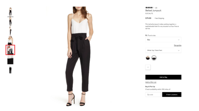
Nordstrom understands how important it is to offer customer service during the buying process. By ensuring that customer concerns are addressed during the buying process, Nordstrom can help customers make more informed decisions. The highlighted image above is actually a video, but with a very interesting twist.
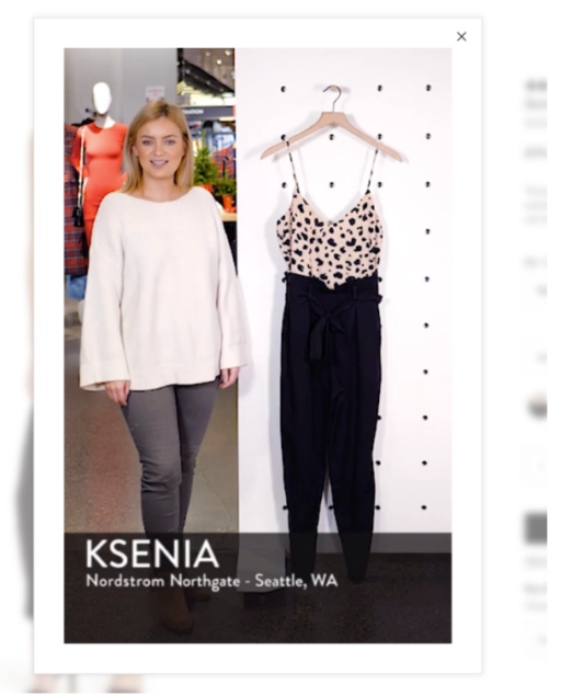
Nordstrom has taken a different approach to online shopping by creating videos of its sales reps talking about the product. They do this to mimic the experience of going into a physical store and give customers the feeling that they’re able to interact with a member of staff face to face.
Example 9: Perfect Keto
What you should take from this example
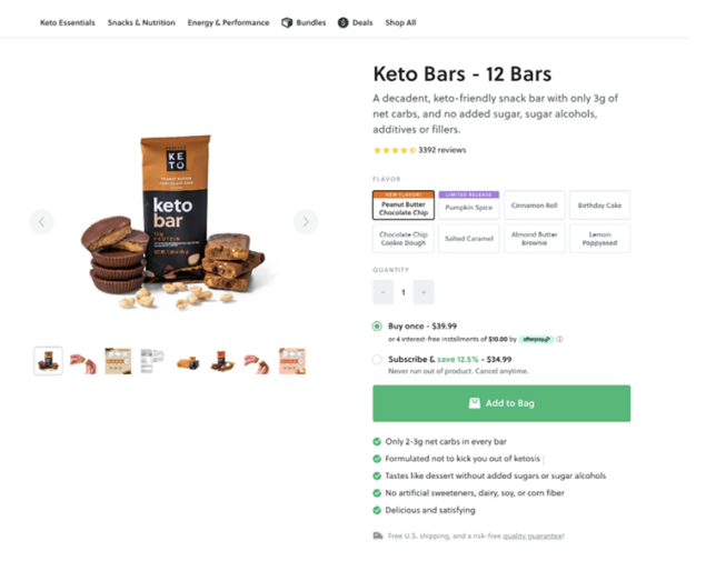
Perfect Keto checks many boxes for fast and easy product page optimization. It helps to provide shoppers with the information they need as quickly as possible by using a descriptive title, description, and bulleted list of benefits. They also do a great job of showcasing customer ratings with clear reviews from verified customers to ensure authenticity.
Perfect Keto also offers multiple payment options, including interest-free installments or recurring orders through subscribe & save that can be canceled at any time without incurring a penalty.
Example 10: Joseph & Joseph
What you should take from this example
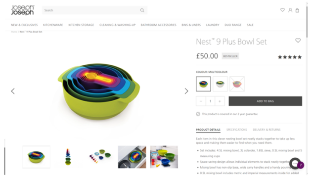
This page has it all and does everything to describe and represent the product’s features and uses. There are great pictures of the product in action, while the exact specifics on what is included in each purchase can be seen with a quick glance.
Customers have peace of mind knowing that returns and deliveries are easy and will be assisted by an extensive two-year guarantee. They also add reassurances to the potential buyers by simply highlighting the product as a “best seller”.
Whilst above-the-fold content looks fairly standard for product pages for each specific SKU, you get to the good stuff when you scroll further down. Joseph & Joseph uses UGC social proof content on their product pages, and they have loads of it.

Example 11: Fabletics
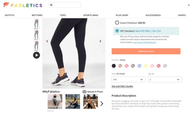
Fabletics is a brand that offers high-quality workout gear at an affordable price. The company’s USP is affordability and the product pages on the site emphasize this by displaying VIP membership prices prominently.
What you should take from this example
Fabletics also has lots to offer elsewhere, such as with the integration of UGC social media content for real-life customers who wear the clothing. You can see these directly below the main product image. This is a massive boost in terms of social proof and showing “real” people wearing and using the product. For example, Bazaarvoice asked a pool of Millennials and Baby Boomers how much user-generated content played into their purchase decisions: 84% of Millennials said UGC had at least some influence.
They also provide reviews from people about how they feel after wearing the products to convince the customer to grab themselves a bargain. In terms of the image and videos available, Fabletics stick to best practice with multiple high-quality images and a short product video similar to ASOS and Nike.
Example 12: Glossier
What you should take from this example
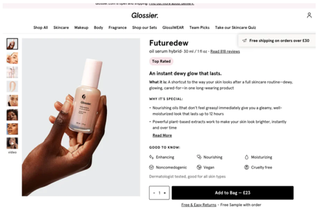
Glossier’s product pages are focused on social proof and the clear display of product benefits. By highlighting an item’s unique selling point and noting whether it has a top rating, the product pages on this site are sure to entice customers. Glossier also clearly show how many reviews are actually available for the product, we can see for this particular example there are over 800 which again will build trust within the product.
Similar to Nike, ASOS, and Fabletics we can also see a video is available to see the product being applied. Multiple images are also displayed with a variety of different skin tones to show the application of the product.
Example 13: Bellroy
What you should take from this example
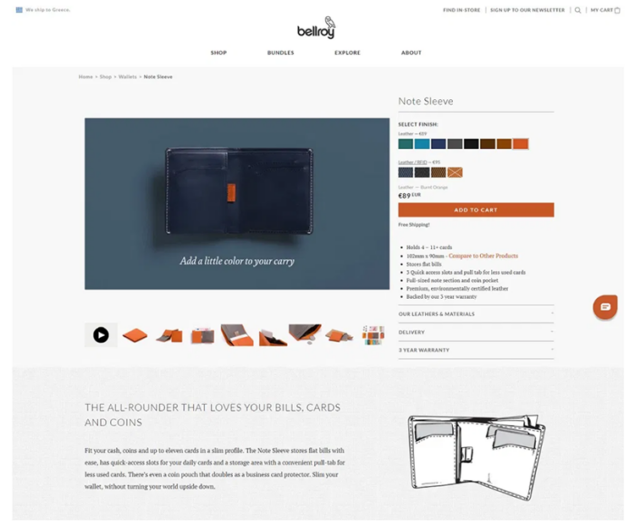
Bellroy’s goal with their product pages is simple: Help potential buyers as best they can to make better-informed purchasing decisions.
They offer customers two size options based on their wallets’ use cases and, depending upon your national currency, Bellroy suggests which one would be a perfect fit.
One of the best features of this product page is the size comparison chart they use.
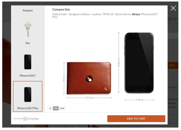
Using Tangiblee, a third-party service that lets you compare the product size with items from your home or office, such as an iPhone. For example, if you’re considering buying a wallet but wish to have a better understanding of how big it is, and how it will fit in your pocket, this function should provide a clear perspective.
Closing thoughts
The product page is a key customer journey touchpoint and is a driving force for e-commerce businesses. Make sure your product pages answer shoppers’ questions and encourage them to buy with descriptions that are engaging, creative, and entertaining.
Use the quick checklist below to ensure that your product pages are following best practices.
- Use a descriptive product name
- Use an identifiable, high-quality image(s)
- Allow for a zoomed-in view of an image(s)
- Clearly display price, offers, or discounts
- Users should be able to easily select what size and color they want.
- Highlight product availability. Use scarcity if you can to entice purchases.
- Clear call to action/add to cart button
- Use social proof (reviews, star ratings, etc.)
FAQ
What is a product page?
A product page is a specific page on an eCommerce website that includes specs, features, reviews, etc. This page should help answer any questions users have about the product and facilitate the buying process.
What should be on a product page?
There are some common features all great product pages have in common. These include:
- A high-quality feature image, with additional gallery photographs.
- A compelling product description that proves why this product is the right choice.
- Ample social proof, such as reviews, ratings, or even user-generated content.
- Similar product suggestions (upsell and cross-sell).
- Live chat feature to answer any immediate questions the user may have.


