Did you know that we make up to 90% of our snap judgments on products based on their color alone? That’s huge and the main reason why you should keep on reading.
You may have already heard such things as “blue is the color of trust” and “red is the color for passion.” Colors and their psychological effects can make or break your first impression as a brand. It’s an absolute must that you harness the power of color meanings!
Luckily, it’s a pretty interesting subject, plus your knowledge of color theory will help you outside of your business, too (think choosing the right outfit or decorating your home).
Take this golden opportunity to learn:
- What is color psychology
- The basics of color theory
- What are the most common color associations
- How colors affect our emotions and behavior
- How to use the psychology of color in marketing to build your brand
Feeling excited about all the sales you’ll make thanks to choosing the right colors? Read on!
First, let’s get familiar with two main concepts: color psychology and color theory.
What is color psychology?
In short, color psychology examines how colors affect our behavior.
Its goal is to understand the relation between colors and emotions and how different colors influence our daily decisions. Colors play a huge role in such things as purchasing a ripe banana to repainting our rooms or deciding whether to approach that guy with a light-blue shirt at a rooftop bar.
Color psychology in different cultures
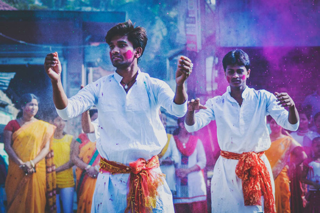
While we can, for the most part, agree on the most common color associations, color psychology is not all black and white. There’s always a level of subjectivity around this topic. You may come across various interpretations between different cultures, plus the same color can mean different things depending on our values or gender, so be aware of that.
Let’s take the color white as an example. In most parts of the Western world, it’s seen as the color for innocence and purity, a new beginning. Whereas, in many Eastern countries, it’s the color of mourning.
Nonetheless, some colors have a universally accepted understanding of how they make people feel and behave, and that’s what we will analyze in this article.
What is color theory?
So, now we know that color psychology is the study of how colors affect our behavior. What’s also important to know is that it couldn’t exist without color theory.
Color theory deals with color wheels, charts, and guidelines on how colors should be used together. Designers use it to choose the best colors to create websites, logos, packaging, and everything else visual in branding.
The basics of the color wheel
You’ve probably seen the image below many, many times - it’s the color wheel. It was created in 1666 by Sir Isaac Newton and is used to organize colors. Designers and artists refer to the color wheel to this day to mix and match different colors in their work.
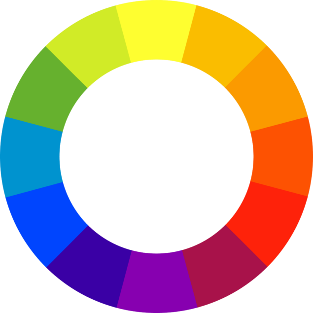
The color wheel is made of:
- Three primary colors (red, yellow, blue)
- Three secondary colors (green, orange, purple)
- Six tertiary colors (two-name colors, such as red-purple and yellow-green)
Let’s understand the terms a bit better.
- Primary colors
The primary colors are red, yellow, and blue. They are used to make all other colors.
- Secondary colors
Secondary colors (green, orange, and purple) are the direct result of mixing primary colors.
Red + blue = purple
Blue + yellow = green
Red + yellow = orange
- Tertiary colors
Tertiary colors are created by mixing primary and secondary colors. The names of these colors include two different colors, e.g., red-purple.
Here’s how a full color wheel looks (notice the two-name tertiary colors).
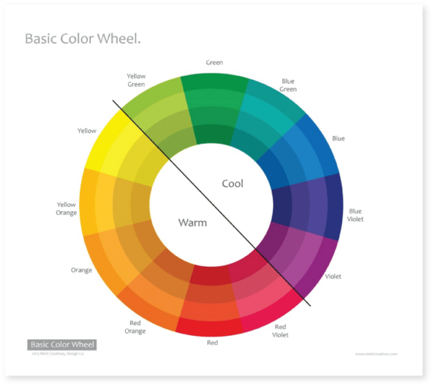
As you can see, if you draw a line where the primary yellow meets tertiary yellow-green down to the red-violet and violet, you separate warm colors, such as reds, oranges, and yellows, from cool colors (blues, purples, and greens).
How warm colors make people feel
Have you ever entered a yellow room and felt a little anxious? You’re not alone.
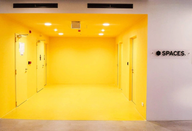
Bright colors like yellow reflect more light and, as a result, stimulate our eyes more than other colors, which may lead to irritation. So it’s probably best not to choose yellow as the background of your website but instead use it someplace where you want to attract attention, e.g., a call-to-action button.
However, colors like yellow and orange work well for stimulating appetite, so they’re great for food stores and restaurants. Only make sure not to go overboard with them!
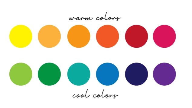
Overall, warm colors can make people feel various emotions that range from feeling comfortable and cozy to feeling anger and hostility.
How cold colors affect our mood
Cold colors are the ones on the blue side of the color wheel, and they are usually associated with feeling calm but can also evoke indifference or sadness. If you’ve ever wondered, “Does the color of a room affect human behavior?”, yes, it does.
For example, the color green is great for creating a peaceful environment as it causes less strain on our eye muscles. Blue also has a similar calming effect. It’s a good color to paint your bedroom to help you relax and get the rest you need. It can even lower blood pressure!
Purple is an interesting mix of stimulation and peacefulness as it has both red and blue in it. It’s said to boost your creativity.
Why the psychology behind colors matter in marketing
As you now know, the psychological effects of color significantly impact how we perceive our surroundings. Some colors in a room you just walked in will influence your mood for the better, while others may leave you feeling agitated. The same goes for your branding.
To succeed with your business, you need to figure out what your target audience wants and communicate it in the right way. And you won’t get away without using color psychology, whether you own a traditional brick-and-mortar business or an e-commerce website.
Your choice of colors directly influences how people respond to your brand.
Some colors will make you stand out from your competitors, while others will make you look dull. You may look trustworthy and reliable or way too bold and childish. Remember, we make up to 90% of our snap judgments on products based on their color alone!
The psychology behind 10 main colors
Now that we understand the importance of the color wheel in marketing, let’s analyze the psychology of different colors to see which ones are the best fit for your business.
1. Red color psychology
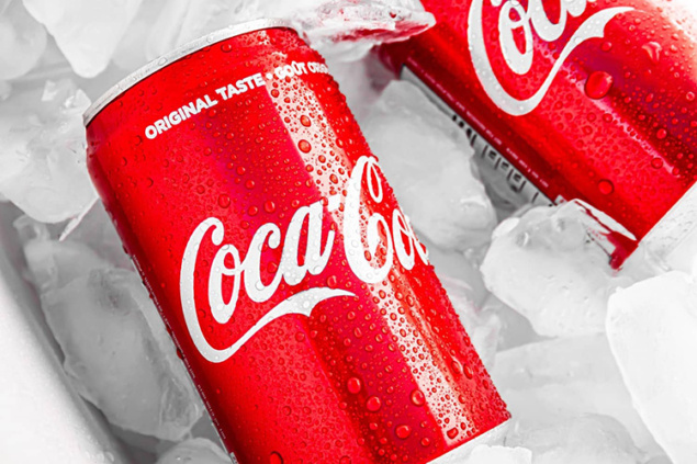
Red is the color for getting attention. It’s bold, powerful, and energizing. Red color products immediately stand out from the rest on the shelves – it’s the most intense color from the color wheel!
Here are some of the most common red color associations:
- Energy
- Excitement
- Passion
- Action
- Danger
Red can evoke all kinds of strongest emotions, ranging from love to terror.
Unless you’re creating an art project, don’t go overboard with the color red. It’s best to use it sparingly and reserve it for call-to-action buttons (BUY NOW) or other places where you want to draw someone’s attention.

Have a look at some of the well-known brands that use the color red in their logos:
2. Orange color psychology
Orange is a blend of red and yellow and combines energy with friendliness and positivity. It’s a very sociable and happy color, no wonder many famous brands use it in their logo across different industries from children’s TV (Nickelodeon) to finances (Mastercard) and food and beverage brands (Fanta).
Here are some of the most common orange color associations:
- Friendliness
- Happiness
- Comfort
- Positivity
- Motivation
- Fun
- Cheerfulness
Have a look at some of the well-known brands that use the color orange in their logos:
3. Yellow color psychology
Yellow is a very visible, bright color. It’s thought that yellow is the first color infants respond to. It symbolizes joy and optimism, and it’s a great color for inspiring your customers to treat themselves.
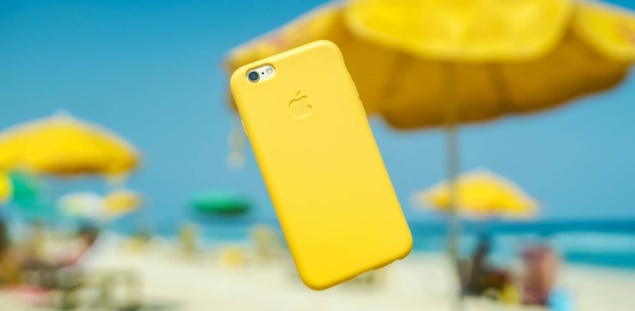
However, be aware that the color yellow can also trigger more negative associations related to danger or feeling anxious. Think crossing and danger signs.

Here are some of the most common yellow color associations:
- Happiness
- Optimism
- Positivity
- Summer
- Warning
Have a look at some of the well-known brands that use the color yellow in their logos:
4. Green color psychology
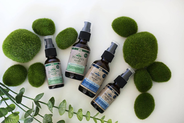
Green is your go-to color if you want to evoke emotions connected to nature, growth, and health. It’s a wonderful choice for brands that sell supplements or are related to fitness and health.
The color green is also associated with money and generosity. However, be aware that green is also the color for some negative emotions, such as envy.
Here are some of the most common green color associations:
- Balance
- Harmony
- Health
- Growth
- Nature
- Rest
- Peace
- Wealth
- Envy
- Materialism
Have a look at some of the well-known brands that use the color green in their logos:
5. Blue color psychology

What comes to your mind when you think of the color blue? Close your eyes and wonder for a minute. Chances are you saw the sea or the sky. Or Facebook! Blue is commonly associated with the water element and symbolizes harmony, stability, and peace.
However, just like the sea can be calm and peaceful, it can also be uninviting and dangerous. For this reason, the color blue is also associated with some negative meanings, such as depression and distance.
Here are some of the most common blue color associations:
- Harmony
- Stability
- Peace
- Calm
- Professionalism
- Reliability
- Distance
- Depression
- Coldness
What’s also interesting about blue is that it’s one of the last colors to be seen. This research says that we didn’t really see the color blue until modern times (or at least didn’t have the name for it). That’s why blue sometimes can be understood as distant.
Nevertheless, blue is widely used in branding since it symbolizes reliability. Think brands like Facebook or Walmart.
Have a look at some of the well-known brands that use blue in their logos:
6. Purple color psychology
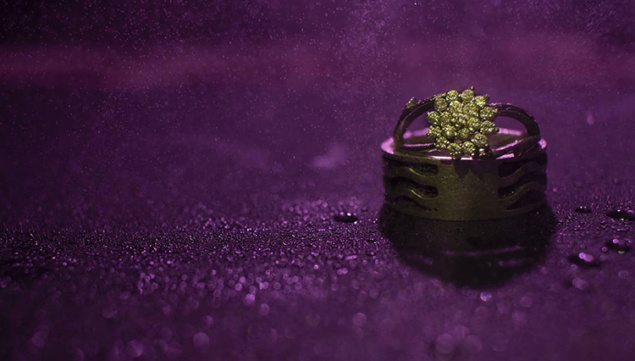
The color purple is a mix of blue and red, combining energy and power with reliability. You can rarely see purple in nature, making it a very spiritual color that evokes mystical associations. There’s something about purple that connects it with the unknown and supernatural.
It’s a very intriguing color that luxury brands commonly use. Purple symbolizes royalty and wealth. But be careful not to overuse it, or your branding may come across as arrogant.
Also, mind different shades. Light purple has romantic, light-hearted energy, whereas darker purple may evoke sadness or even frustration.
Overall, be cautious with this color. People either love it or hate it!
Here are some of the most common purple color associations:
- Power
- Wisdom
- Creativity
- Luxury
- Wealth
- Spirituality
- Mystery
- Arrogance
Have a look at some of the well-known brands that use purple in their logos:
7. White color psychology
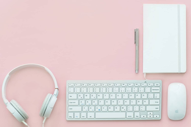
As you may have guessed already, the white color stands for innocence and cleanliness. It’s often associated with something good and pure. It’s also the color for new beginnings and idea creation.
However, be mindful of different meanings across the world. While white is all the things we mentioned above in Western culture, it’s the color of mourning in the Eastern world.
Plus, like all other colors, white has some negative meanings, too. For example, it can be interpreted as sterile and cold.
Here are some of the most common white color associations:
- Purity
- Innocence
- New beginnings
- Balance
- Simplicity
- Cleanliness
- Idea Creation
- Emptiness
- Loneliness
Use white to create a clean background for your website. White also helps to create contrast with other, more intense colors.
8. Black color psychology
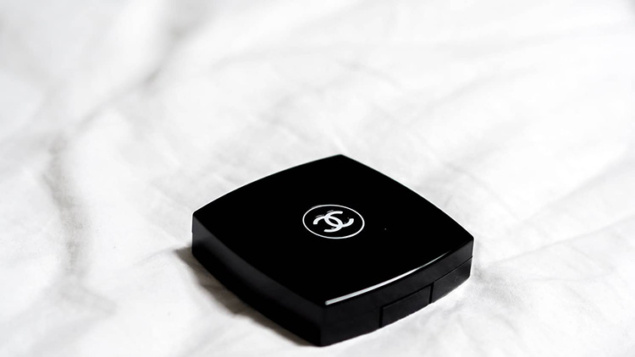
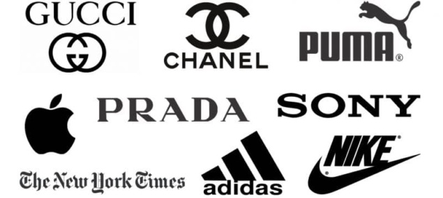
In color psychology, black is the color for sophistication, power, and elegance. It’s especially prevalent in the fashion industry. Think brands like Chanel or Prada. It’s also common among retailers, such as Nike or Adidas.
Black is easy for the eye and is a great choice to create contrast. It completely lacks any light as it absorbs all wavelengths. However, be mindful not to overuse black in your website as it can cause negative feelings like sadness.
Here are some of the most common black color associations:
- Elegance
- Sophistication
- Power
- Mystery
- Anger
- Sadness
Have a look at some of the well-known brands that use black in their logos:
9. Gray color psychology
Gray is the color for maturity, impartiality, intellect, modesty, and, sometimes, sadness. In general, it’s a relatively neutral color, but when used too much, it can evoke feelings of boredom and loneliness.
Here are some of the most common gray color associations:
- Intellect
- Impartiality
- Modesty
- Maturity
- Sadness
Gray works great as a complementary color. Pretty much all colors look nice next to it, making gray an excellent choice for your website design. For example, you could use gray in your graphics or header. It’s also a common color for fonts.
10. Brown color psychology
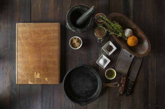
Brown is the color for comfort, reliability, and relaxation. It’s very down-to-earth by its nature and works great for brands that sell natural products and the food industry. Brown is also associated with dependability and nurturing.
However, just like the sight of a vast, empty landscape, the color brown can also evoke feelings of boredom, dullness, loneliness, and isolation.
Here are some of the most common brown color associations:
- Earthiness
- Nature
- Comfort
- Warmth
- Security
- Strength
- Reliability
- Loneliness
- Isolation
Color psychology: color associations by percentage
In this survey, people were asked to tell which colors they associate with particular concepts. Here are the results by percentage:
Colors of Trust: blue (34%), white (21%), and green (12%)
Colors of Speed: red (76%)
Colors for Security: blue (28%), black (16%), green (12%)
Colors of High Tech: black (26%) and blue and gray (23%)
Colors of Cheapness: orange (26%), yellow (22%), brown (13%)
Colors of High quality: black (43%) and blue (20%)
Colors of Fun: orange (28%), yellow (26%), and purple (17%)
Colors of Courage: purple (29%), red (28%), and blue (22%)
Not sure how to choose the best color for your brand? Follow these steps

Chances are you’ve read the whole article, and you’re still not sure which colors are the best for your brand. Even though it can feel a little frustrating, it’s totally normal!
You have to know what you want to communicate with your marketing first and only then look for the right colors.
- Start by figuring out your overall mission and vision as an entrepreneur.
Even if you’re not planning on hiring five hundred people, you still need to have clearly defined values and goals for your business. They will help you to form the direction for your marketing strategy.
Once you’ve got your brand vision and mission figured out, follow the next steps to choose the best color for your brand.
- Analyze your target audience. Gather information on your ideal customers. Which parts of the world do they come from? What’s their demographics? Cultural background, gender, and age are factors that play a significant role in color preferences.
- Before making huge changes to your website, create a test to determine which colors your potential customers are most receptive to.
For example, you can run two identical Facebook ads where everything is the same (text, targeting, budget), but the visuals differ in their color. Run a few similar ads by testing different colors, and by the end of those tests you’ll have your winners.
FAQ
What psychology says about colors?
According to color psychology, color can be a powerful trigger that can be used to influence our mood, behavior, and even physiological reactions. For example, the color red is linked to increased heart rate and metabolism and yellow can cause eyestrain. By choosing the right colors in your branding, you can associate your products and services with reliability (blue) or high quality (black).
What colors trigger what emotions?
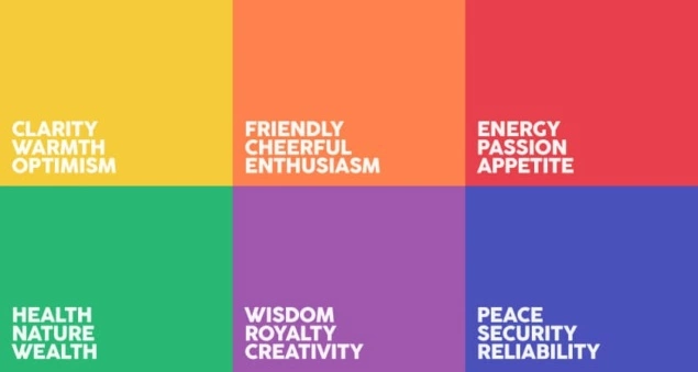
Red is the color for energy, passion, excitement, and boldness. Orange is the color associated with friendliness, cheerfulness, and enthusiasm. Yellow stands for the sense of clarity, warmth, and optimism. Green is the color for feeling balanced and peaceful. Purple makes us feel luxurious, powerful, and spiritual. Blue evokes peacefulness, security, and stability. Black makes us feel elegant, sophisticated, powerful, and sad. White triggers purity and the feeling of new beginnings.
Which colors are best for marketing?
Think about how you want your target audience to perceive your brand. Do you want to look bold and powerful? Think about using red or purple in your branding. Maybe you want to establish yourself as the most trustworthy business in your niche? Then the color blue should be at the center of your website. Or perhaps you are going for an earthy, nature-loving look? Then brown and green are your go-to colors. The point is, the best color for your marketing is the one that conveys the message you want to send to your customers.
What colors are associated with luxury?
If you want your brand to be associated with luxury, go for purple. This color is rarely found in nature and has long been connected with luxury and nobility for centuries. The reason for this comes from the fact that the purple dye was very costly to produce, which made purple fabric very expensive, and only the richest people could afford it.
