Customers abandoning their carts before completing a purchase are a major problem for online businesses. Each year, e-commerce companies lose over $18 Billion in revenue due to abandoned carts. This is a huge loss of potential sales for online businesses. With a 21% open rate, abandoned cart emails can effectively prevent lost sales.
There are many strategies to winning back customers who left their cart, so let’s look at the 11 best-abandoned cart email examples and why they make an impact.
Abandoned cart emails: what are they?
Abandoned cart emails recover lost sales by getting customers who didn’t complete their purchase back to your store.
They can offer a better deal or provide support to customers or just serve as a simple reminder to finish checking out. Abandoned cart emails are a helpful reminder to forgetful or hesitant buyers and an invaluable customer retention tactic for online businesses.
Why are carts abandoned?
There are many reasons why customers abandon their cart:
● The price is too high.
● There was an unexpected cost such as shipping.
● Your customer isn’t confident they like the product yet.
● They forgot to checkout.
● They were just browsing.
Whatever the cause, the businesses in this list have great abandoned cart email examples that address the issues above.
11 Abandoned cart email examples to inspire you
1. Consistent branding
An abandoned cart email’s main goal is to recover the sale, but there are other goals your email can achieve. Even if your customer doesn’t change their mind about the items in their cart, you can still convince them to return to your store.
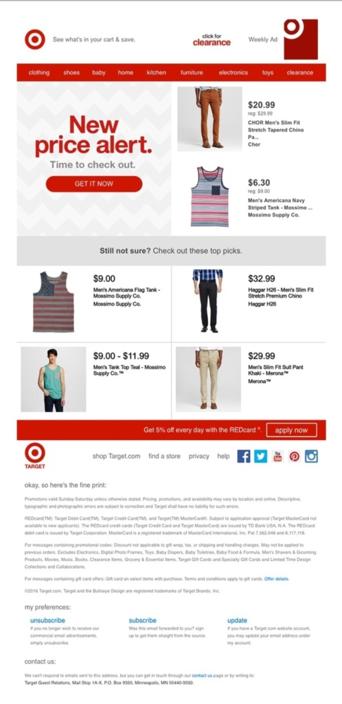
Keeping your emails’ look and feel the same as your store’s can be a big help here. For example, Target provides their store navigational header within their email and presents their recommendations in the same format as their online store. This helps create a seamless transition between reading the email and browsing for products.

2. Responsive design
At least 50% of emails are opened on a mobile device. That means if your abandoned cart email isn’t optimized for mobile, it will have less impact on the majority of your customers. A responsive email layout that looks good on a narrow vertical screen is a must.
In this example from Jack Wills, almost all the viewing space is given to the product images to ensure users on any device will be drawn to the items in their cart. On a narrow mobile format, a couple of sentences quickly turns into a block of text, so keeping text short and broken up by images keeps the email easy to digest.

3. Give a clear call-to-action
Always make it as easy as possible for customers to act on your abandoned cart email. This means including a clear, obvious call-to-action that takes the recipient straight back to the purchasing screen.
Make buttons big and bold like in this example from Nomad. There is a sticky CTA button visible on the screen even when the recipient scrolls down. Besides providing the second button to resume the purchase, a third also links customers to new products on their website. This is a great way to give customers an option to keep shopping.
4. Subject lines matter
Writing effective subject lines has a major impact on your ability to recover a lost sale. Often the decision of whether to read your email at all depends entirely on the strength of its subject line. There is a huge range of approaches when it comes to crafting a great subject line, but following these three rules will help your email grab readers’ attention:
● Be descriptive. Make sure recipients know what your email is about.
● Keep it short. Some devices and email clients will cut off your subject line after 35 characters.
● Establish urgency. Ensure customers know they must act soon to avoid missing out.
Your subject line should make your email’s intent clear. Many businesses use a conversational tone or a question to address reasons a customer might have backed out.
5. Offer a deal
On your first abandoned cart recovery attempt, often, a reminder is all that is needed to bring back your customer. If that email gets ignored, however, offering a deal or discount can encourage a hesitant customer.
The obvious route is to offer a discount on in-cart items, but there also other ways to appeal to price-conscious customers. For example, it is possible to provide free shipping on their cart or to draw their attention to other on-sale items.
Columbia’s cart recovery email makes four different offers to appeal to a hesitating customer, starting by offering an in-cart discount. It goes on to showcase several other discounted items, promote their Black Friday sale and remind the recipient of their free shipping offer.
6. Offer help
Price isn’t the only concern that could give customers cold feet. They might just be unsure whether your product is the right choice for them and need more information to make a final decision. Alternatively, they could be having difficulties with your checkout process or struggling to understand the small print. This makes it a good idea to reach out with a friendly offer of help to customers who may be confused or frustrated.
For example, Headspace still includes a checkout button for customers who simply forgot, but the rest of their message is dedicated to providing support links and contact method. This is a great way to make an impression as a helpful and caring business, especially as this could be a potential customer’s first contact with them.
7. Suggest alternatives
Some customers will add items to their cart while browsing only to take a closer look later and decide against the purchase. Your abandoned cart email could still save these customers by offering alternative choices.
Design these emails to showcase a selection of relevant items, enabling customers to compare products and find an alternative without leaving the email. For example, Perigold presents a grid-based layout focusing on product images for easy comparison.
Images increase willingness to read by 80%, with 65% of email recipients preferring to receive messages with pictures.
8. Save the discount
Your customer added their item to the cart during a sale. Now the sale has ended, your customer doesn’t want to pay full price, and all the work you put into marketing the sale could be wasted.
Avoid this situation by emailing customers to let them know you’re holding the discount. Society6 starts their email with a reassuring header telling customers they have another 48 hours to finish their purchase. This is plenty of time for interested customers to finish the transaction while still urgent enough that they won’t procrastinate and miss out again. Including the discount percentage in the CTA button is a great touch, gently reminding customers what they could lose if they don’t take this last chance to buy.
9. Provide social proof
Some customers will abandon their cart because they aren’t convinced yet that your product gets the results they are looking for. The most compelling evidence you can provide to sway them comes from your other customers in the form of reviews and testimonials. 92% of consumers trust unpaid recommendations more than any other content, which is why adding social proof to your email can increase conversions by 15%.
In this example from Adidas, usernames are included along with reviews to assure recipients of their credibility, and Adidas doesn’t only show perfect 5-star reviews either. Seeing reviews with poor scores helps customers trust your user reviews more.
10. Keep it simple
Sometimes a few lines of text and an appealing image are all you need to a buyer’s interest, especially in your first recovery email. At this stage, your customer might only need a gentle reminder to finish their purchase.
This abandoned cart email from Cater2Me is a great example of keeping it simple, with an enticing image filling the screen and a short message that gets straight to the point while also conveying some brand personality. Getting straight to the point is particularly important for time-sensitive industries like food delivery, where you need to recover the sale before your customer makes other dinner plans.
11. Have fun
Abandoned cart emails don’t always have to promote the products your customer was checking out. They can also be an opportunity to promote your brand and convey a memorable identity.
Making people smile is a great way to be remembered. Consumers are inundated with boring sales emails, so giving people a chuckle can stand out as well as improve their perception of your business.
This example from Chubbies stands out by poking fun at the format of sales emails, a smart way of appealing to customers tired of the usual marketing messages. Whether your recover the abandoned cart or not, ensuring a buyer remembers you can increase your chance of a future sale.
Bonus tips to tackle cart abandonment
● Unexpected costs result in 55% of abandoned carts. Offering free shipping where possible can avoid a lot of abandoned carts before they happen. If you provide free shipping options, make sure customers see it on product pages and throughout the purchasing process. Hidden costs are one of the biggest ecommerce mistakes to avoid.
● If you have permission to text your customer, investing in text marketing software with a 99% delivery rate can be a great way to initiate a direct conversation with your buyer or address their issues quickly.
● Add an exit-intent pop-up when users leave the checkout. This allows you to provide support or offer a discount before they even leave the page.
● Ask for feedback from customers who abandoned purchases to find out what is pushing your buyers away. This can provide vital information to avoid future abandoned carts.
When is the best time to send abandoned cart emails?
The first recovery email should go out anywhere from a few hours to a few days after the cart is abandoned. This depends on your business and audience, however. A food delivery business might only have minutes before their buyer goes elsewhere for their dinner, but someone spending a lot of money on high-end products might take more time to consider their purchase.
Sending a series of cart recovery emails lets you try a range of approaches without packing everything into one email. This makes abandoned cart emails a seamless part of your marketing funnel. It can also save your business money by only offering a discount or other incentive when a simple reminder doesn’t work.
Abandoned cart emails bring back customers
Abandoned carts are a big problem, but it can be avoided with better communication. They happen because customers need help, information, a more suitable product, or a better deal.
With the right approach, abandoned cart emails can address any of these problems while also improving your brand image.


